-
Architects: Jim Caumeron Design
- Area: 400 m²
- Year: 2020
-
Photographs:Bien Alvarez
-
Manufacturers: Gessi, ABK Re-work, Blanco, Boysen, Catalano, Ceasar Stone, DAaZ 幕友家具, Durafix, Geotech Tiles, Hafele, Klaric, Lexton

Text description provided by the architects. This is a house with warm interior-core sheltered by a white concrete “hood” with trapezoidal niches that frame the outside views. It is called Viewpoint House designed by Jim Caumeron Design. Located in a dense subdivision in Quezon City, Philippines. the L-shaped lot called for an L-shaped plan to fit the hefty 400 square meter client’s space requirements. The property’s east and back side has no views because it is blocked by a fence-wall owned by neighbors. The west side on the other hand exposes the lot to the heat of the afternoon sun. This side also fronts the street access and a small community park that can pose an issue on privacy if the living areas were to face west.


Jim Caumeron proposed to highlight the view of the park by providing a huge picture window at the corner of the house. This serves as the “mother” window, raised above a standard human height to lessen the visibility of the living room from the street. When one is lounging in the living area, they can look up to the big window with the view of the crown of the tree.

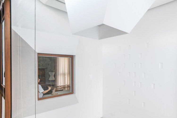
The entrance hallway and stairs were located on the west side with a ribbon window facing the street and the park. Above it is a wall of small punctured windows with a profile section-detail that is slanted to keep the rainwater out while still allowing natural air to seep through it. This wall blocks the sun’s heat in the afternoon but at the same time allows the stair atrium to breathe.

The setback was kept open as small private open areas of the dining room and the guests’ room at the ground floor. The garage adjacent to the living areas is transformable into an extended party area, highlighted by a square frosted glass door from the living room. It is typical for Filipinos during fiestas, christening, house blessings etc. to welcome everyone in the community to feast. Normally, the garage area where a big table can be set up is the best space for it to keep the main living and dining areas private and indirectly exclusive to family and close friends.


At the second floor, two hallway windows are located on both ends for light and cross- ventilation. The hallway has a flank of doors that are recessed on the wall echoing the profile of the window viewports. Behind these recessed spaces are storage and closet spaces. One of these doors is the library with customized tables, lamps and bookshelves. The space was meant to be fully-airconditioned but the architect insisted to make the picture window along the hallway to be openable.

There are also small random windows on the opposite side of the library with few of them that are operable. The window frames were customized wooden casements with magnets for closing. The small windows reflect the punctured windows of the west façade and becomes a backdrop of the library interior when looking towards the hallway. A portion of the corridor is partly family room. When the air-condition is on, a pocket glass door can be pulled out from the wall making the hallway area part of the space.

The owners’ local hardwood collection was used for the second floor and wood finishes that dictated the color scheme of the house. The architect imagined the wood finishes as the warming and comforting element in the interior. The geometric visual language of the exterior can also be seen on the ceiling design and interior furnishings Jim Caumeron designed.


The “mother” window is also used as view portal by two interior windows – the family room and the masters’ bedroom at the second floor. Instead of having a boring blank wall opposite the masters’ bed, the architect provided a bay window seating that overlooks the living areas, family room and the view of the park. Same views can be enjoyed in the family room. This makes the tree at the corner of the park referenced as the viewpoint of the house.


